

“If you work in a business where connecting to creative culture is absolutely essential to your business success these guys have to be on your list. Their creative output speaks for itself, but their strategic acumen and ability to translate strategy to creativity sets them apart. Fact of the matter is that creative success is a matter of referencing culture in a way that aligns to the possibilities of a product or service. They get the culture that matters today. That makes the creative easy.”
- Director, Global Brand Marketing Converse
How do you picture comfort & durable quality? How do you express an element of time in a static image? Converse Essentials were developed to go beyond basic. They are essential to your wardrobe. When worn and washed repeatedly, these Essentials actually get better with time.
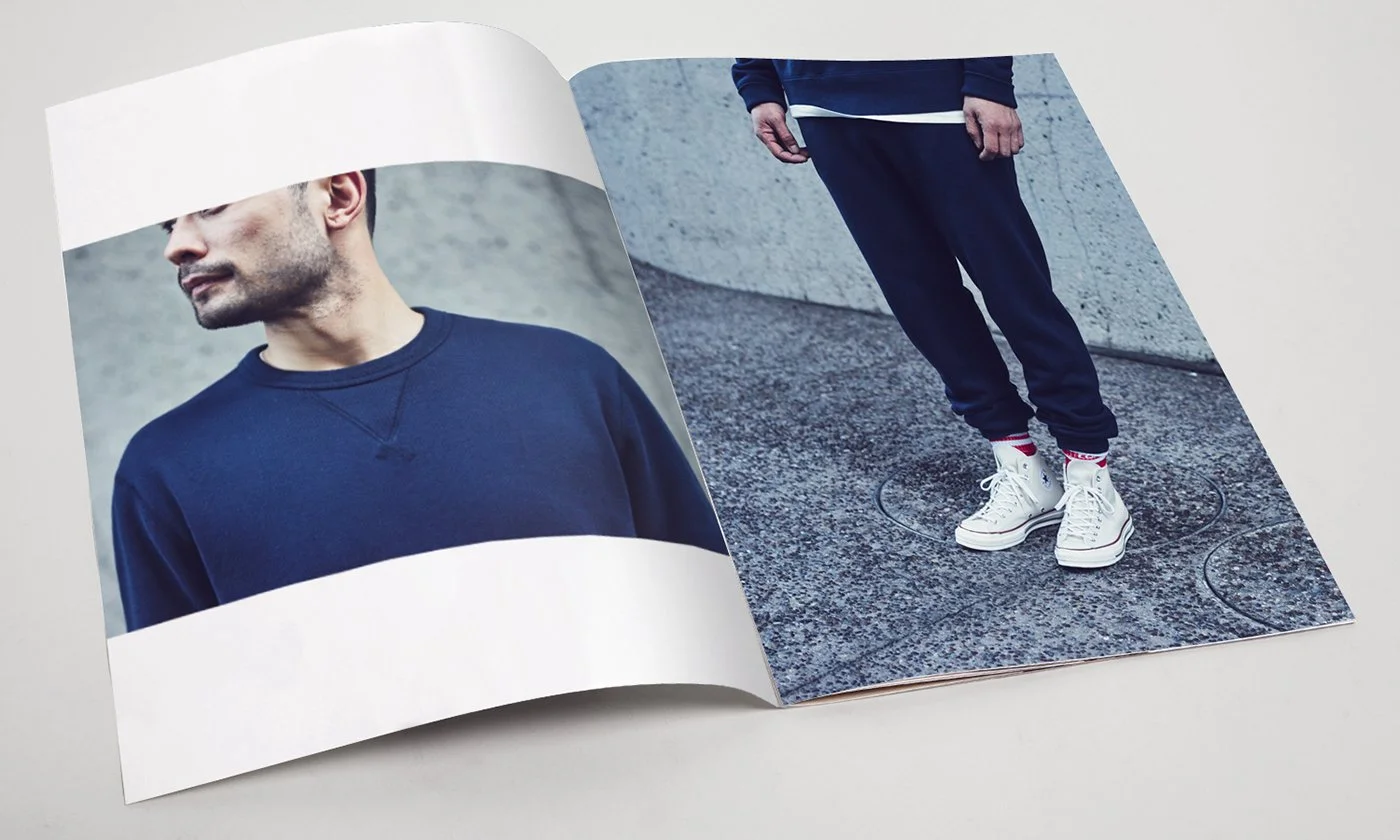
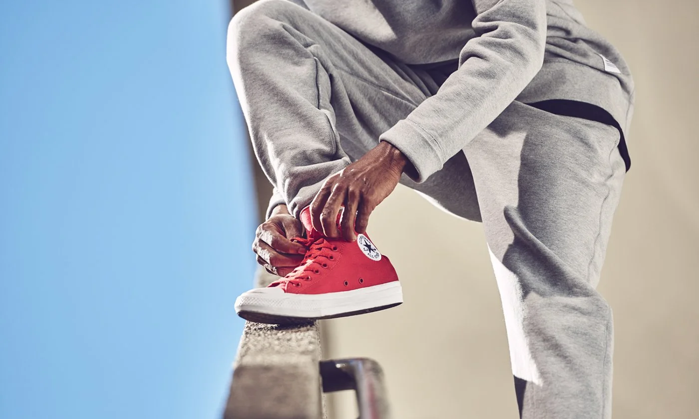
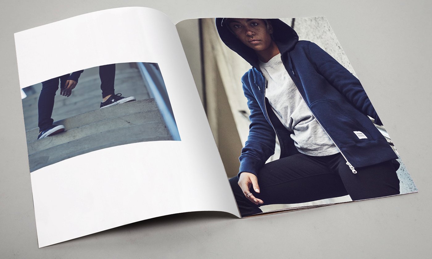
In visuals we highlighted the tactile nature of the product by juxtaposing it with rough concrete, brutalist, modern structures, framing it with hard and gritty textures– focusing the attention on singular figures in angular, harsh landscapes.


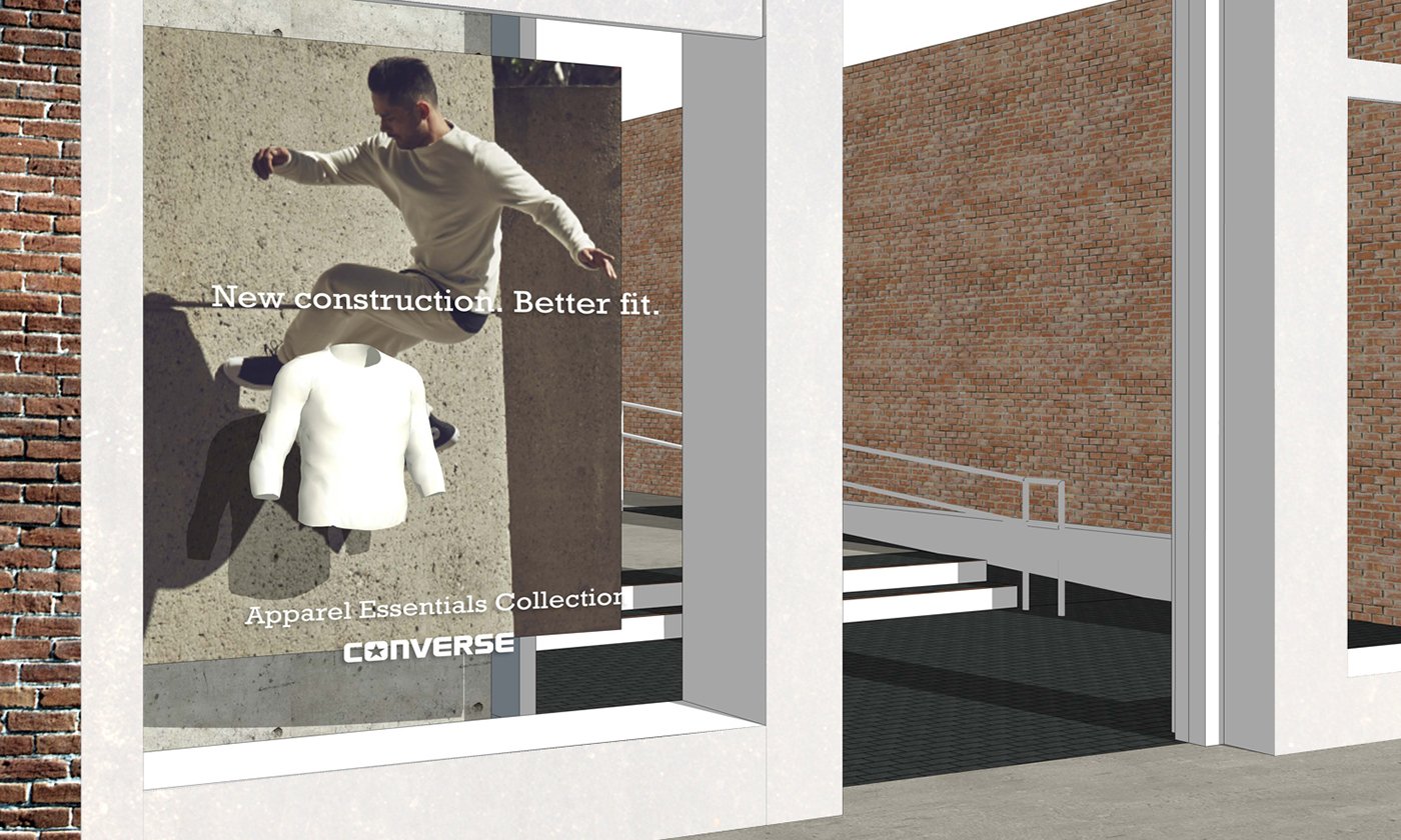
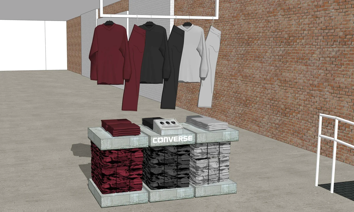
To illustrate the products’ attributes of soft, comfy quality that gets better with time, we introduced a contrast of rough and textured to soft and smooth. In store, the product was showcased on tables made of wire-bailed bundles of fleece sandwiched between concrete slabs.
Contrast was key to represent both softness and longevity. The brutalist backdrop of poured concrete brings texture, warmth through color and a sense of drama to the product as the hero.
Deliverables
GTM Strategy
Campaign Strategy
Creative Direction
Art Direction
Copywriting
Key Visuals
Retail Concepts
Special Thanks To:
The Converse Marketing & Brand Design Team
Carlos Serrao
Photographer
Jukebooth
Video Editor
All Good Things
Producer
Evert Lee
Retail Creative Director
Quarter 20
Retail Renders


