

University of Pennsylvania Athletics
Who
University of Pennsylvania
When
2003
Where
SME Branding
Role
Brand Designer
Thanks To
Ed O’Hara
Executive Creative Director
*Anonymous Photographers and unnamed Athletes of Penn Sports
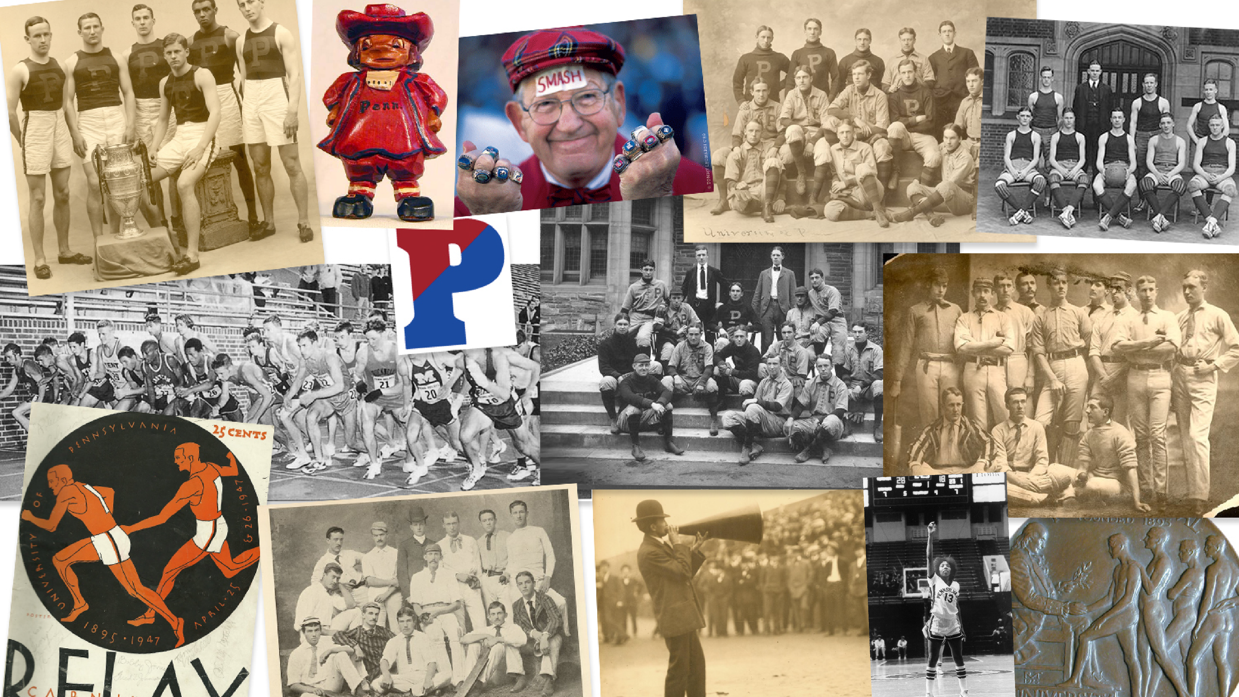

The University of Pennsylvania has a long and storied history. Originally founded in 1740, the university is older than the United States itself.
It is one of eight universities in the Ivy League, which also predates the NCAA, who in 1954 modernized it to what we know today.
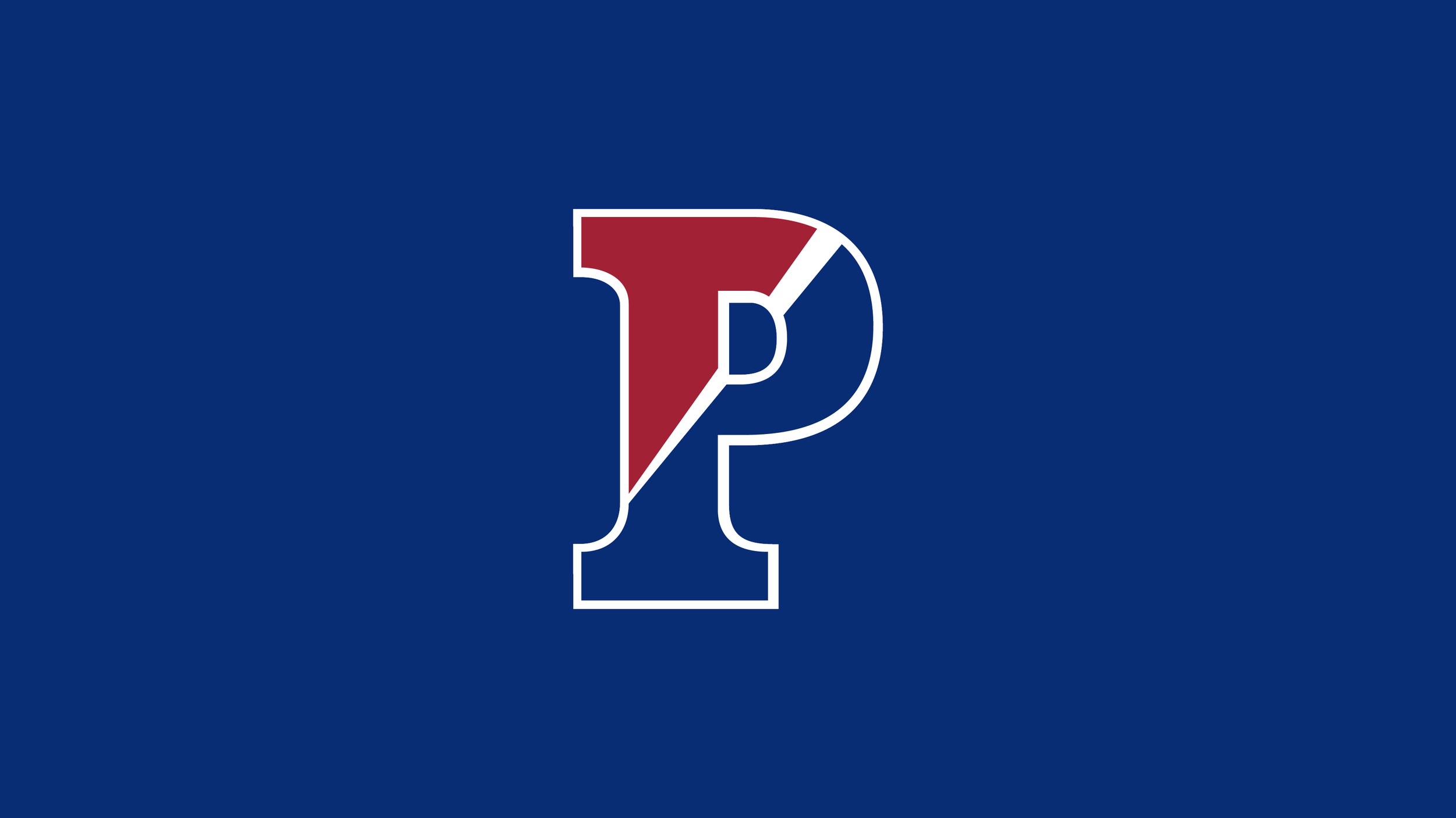
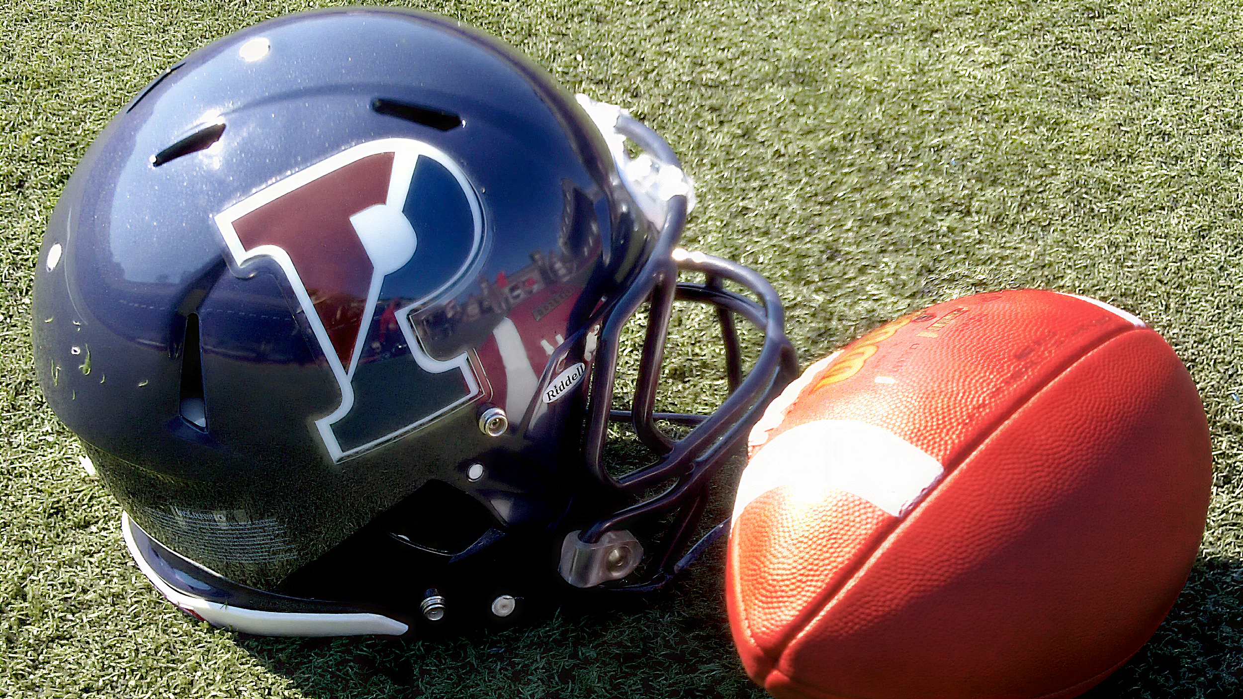
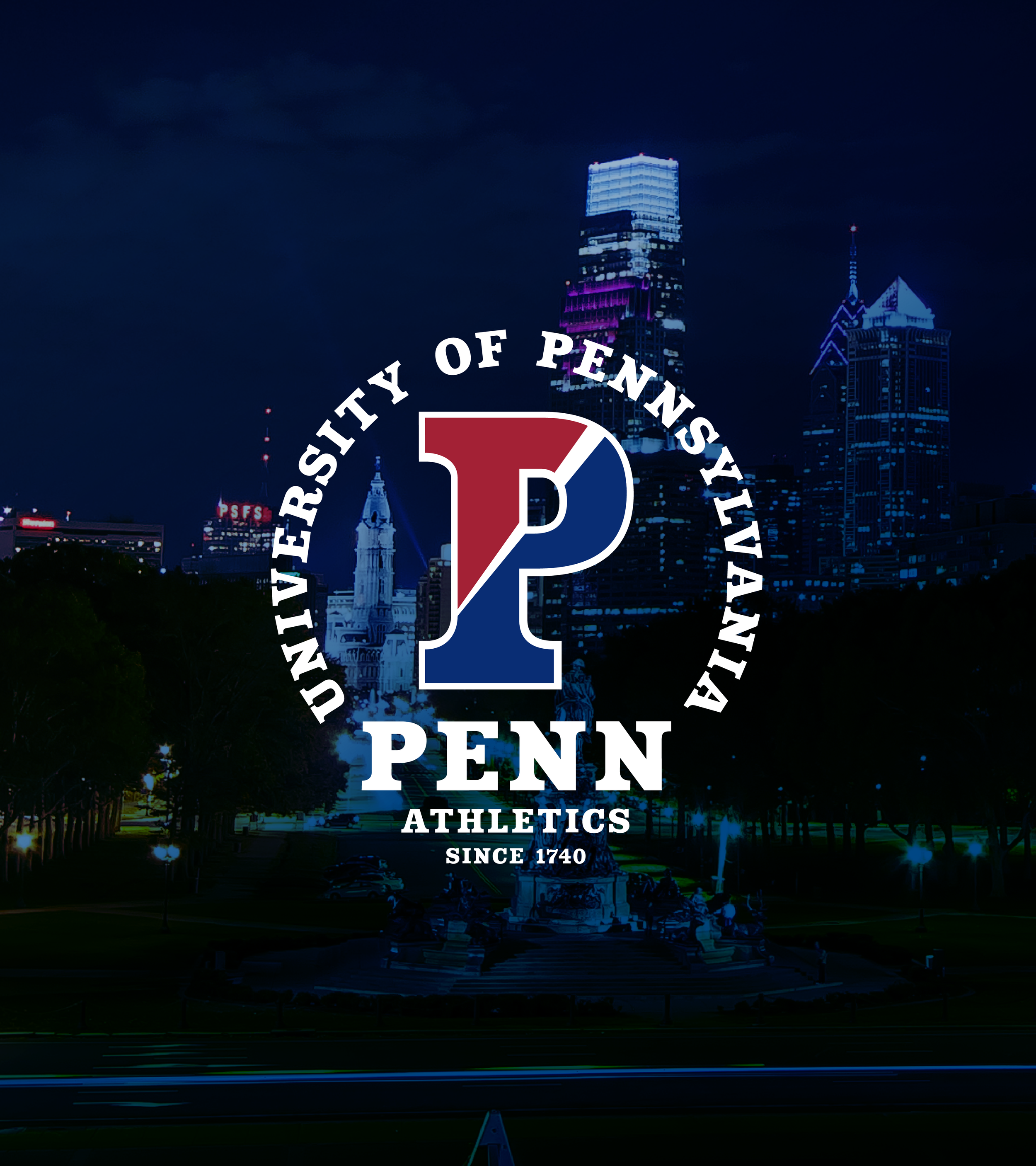
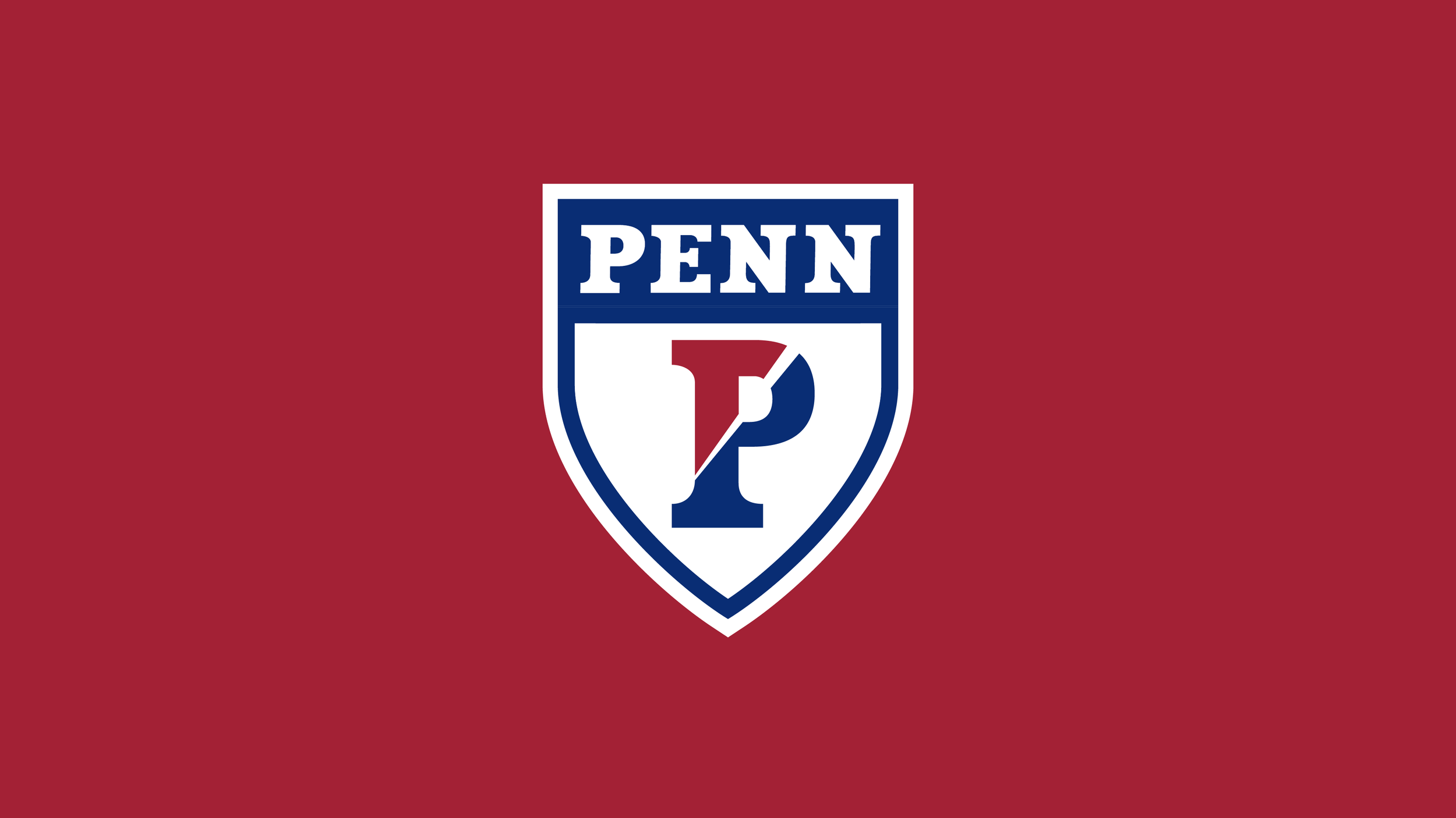
Central to the identity program for University of Pennsylvania was an update to their historic “Split P” mark and a deeply Typographic design solution.
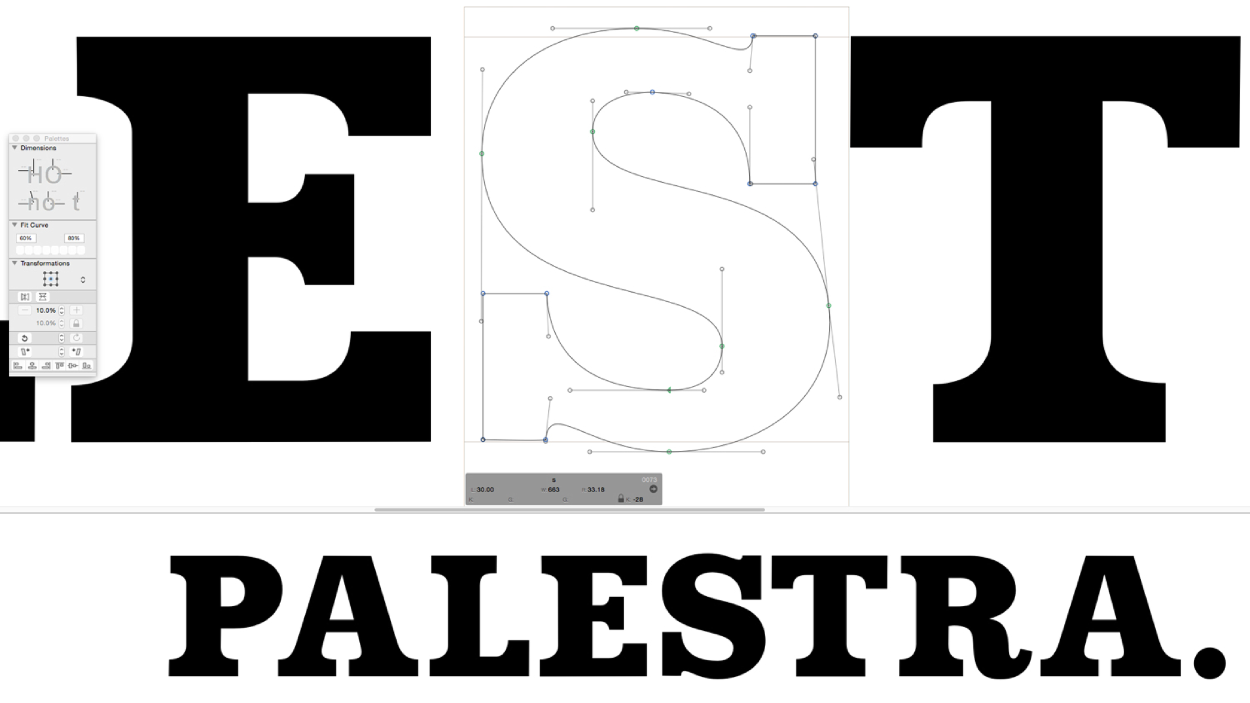
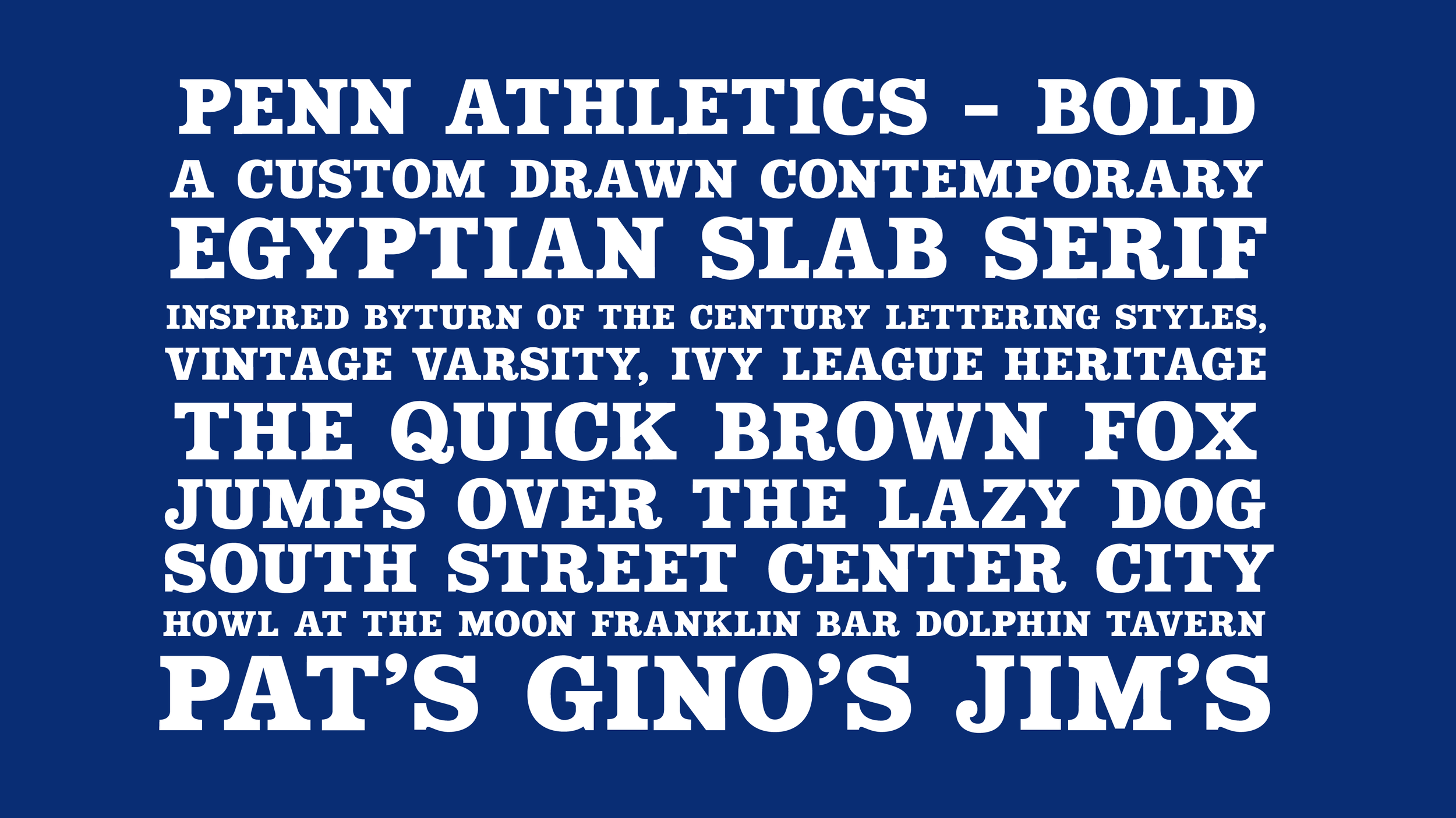
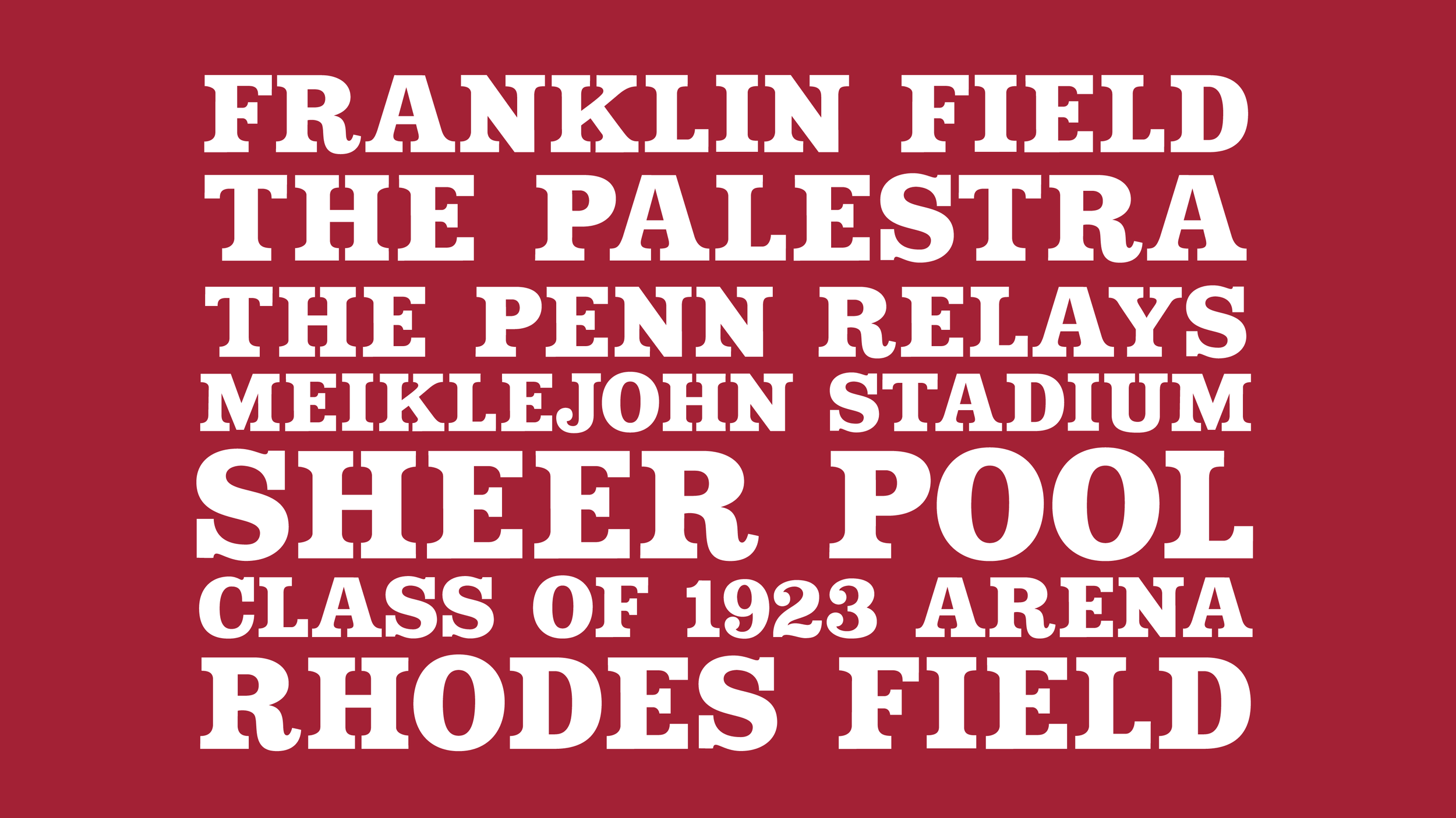
A chunky serifed P based upon turn of the century “Egyptian” style lettering seen in advertising placards and broadsheets.
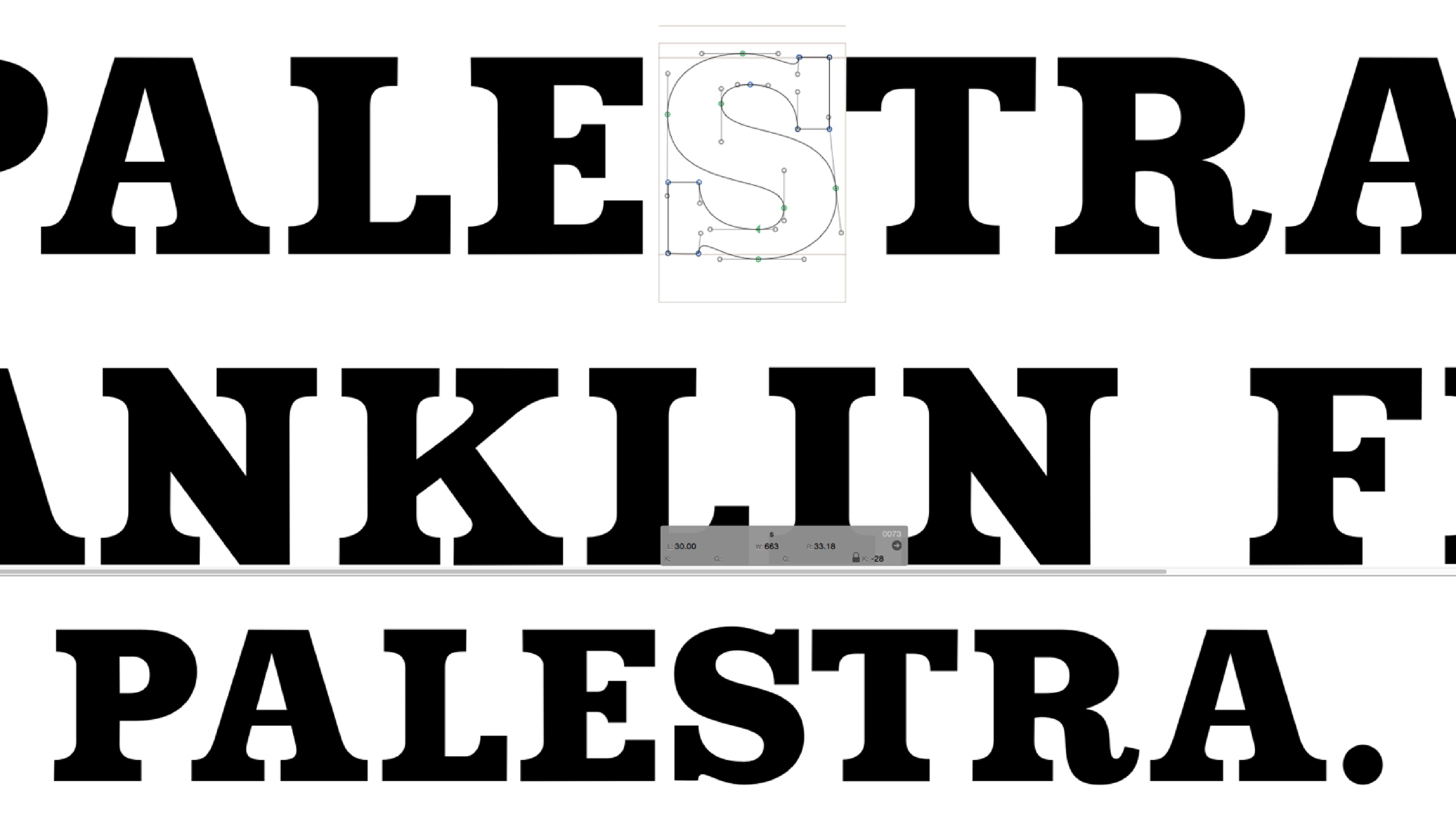
We decided that instead of updating it with a contemporary sport motif, like so much of the universities were doing in the early 2000s, we would look to refine it, by looking to create a custom type treatment inspired by Clarendon, a typeface originally created in the mid 19th century.
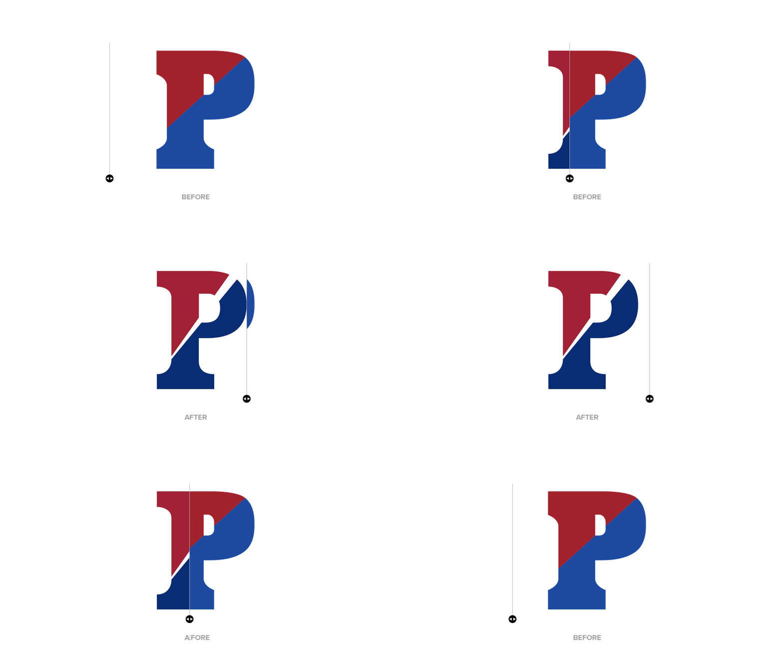


The Split P, itself was rebalanced to accommodate an outline and a more graphic split in the shape of a ray.
The ray is a subtle nod to University founder, Benjamin Franklin, who was a master of symbolism, and often used symbolism.
One of Franklins key symbols was a sun that adorned the top of the first coin of the United States, the Fugio Cent, which he designed. The rays of the Godhead shine down on man in providence and all rays ascend to a singular point of all knowledge and good.
This ray rises and expands like the magnification of an old school cheerleaders megaphone.
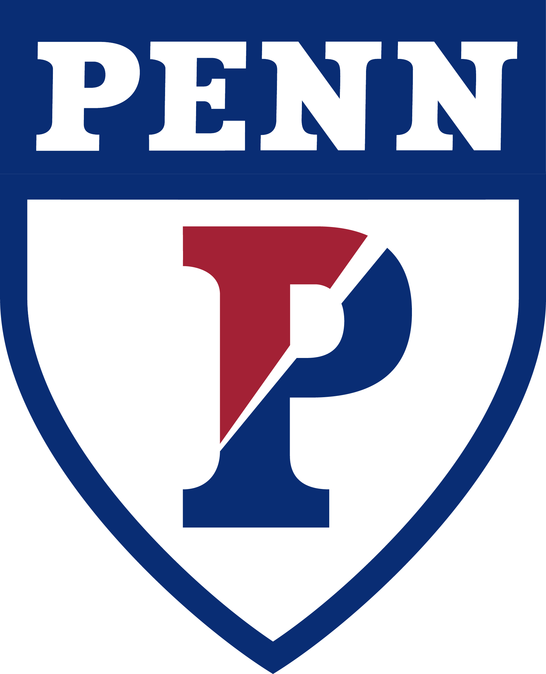
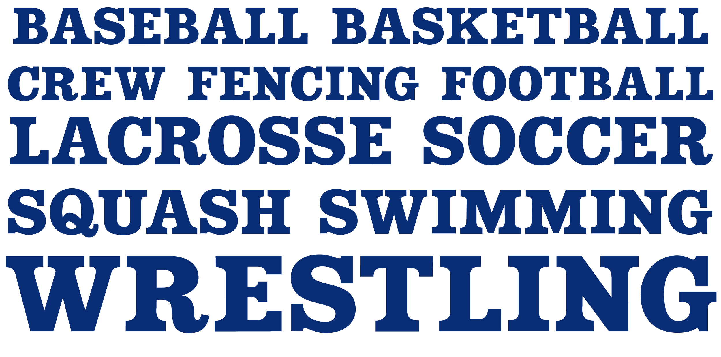
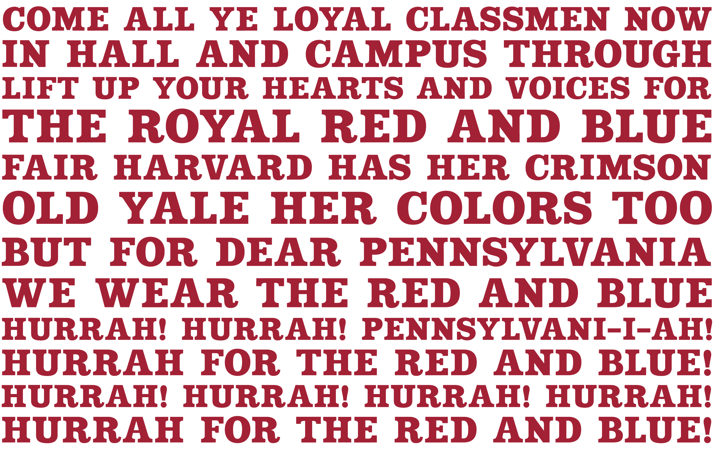
The corresponding custom font that followed the primary mark was meant to do two things. Lock up with the primary mark in a shield and then stand alone for word marks and as support for any number of other needs, like individual sports, signage or even way finding systems.
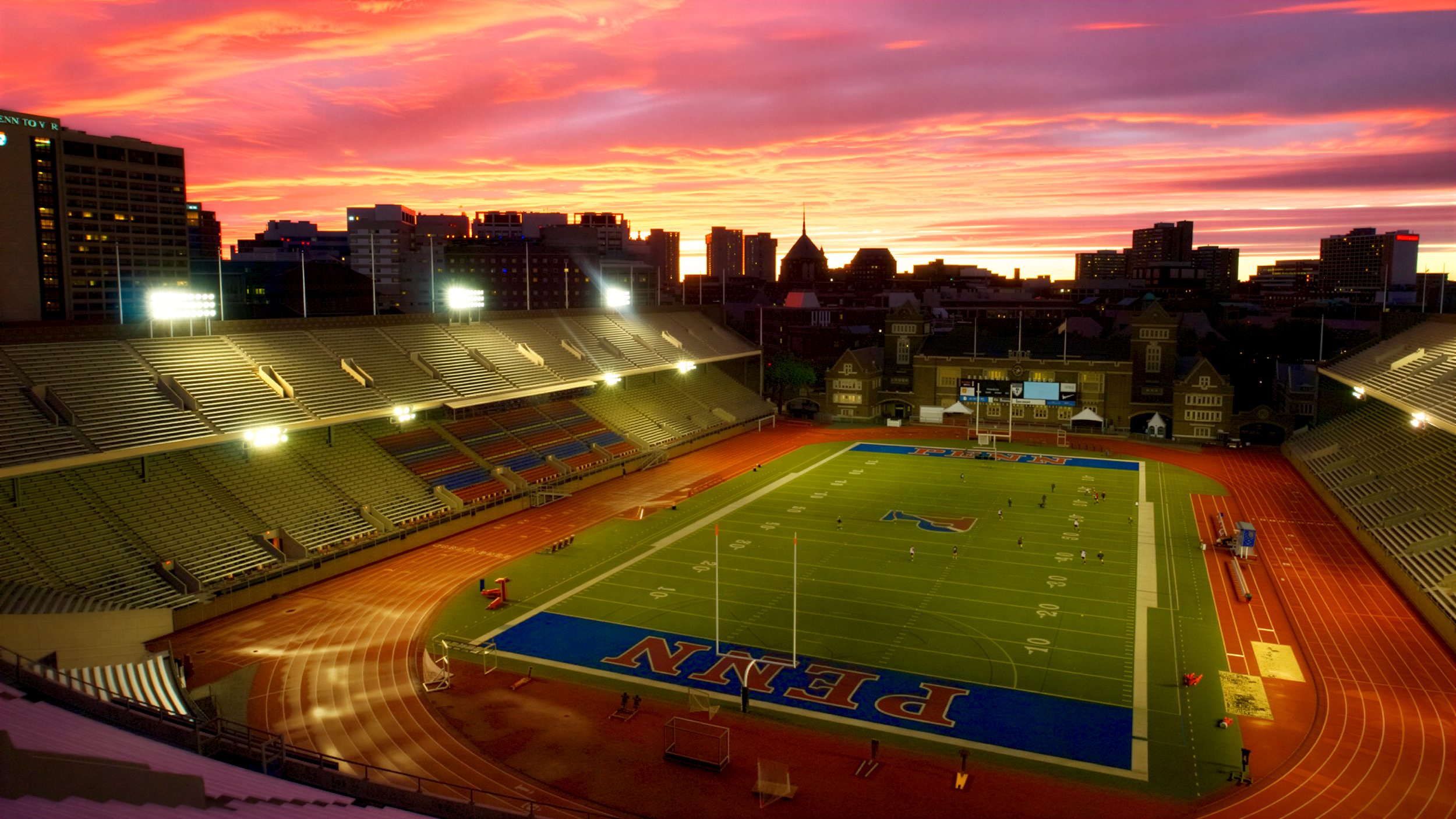












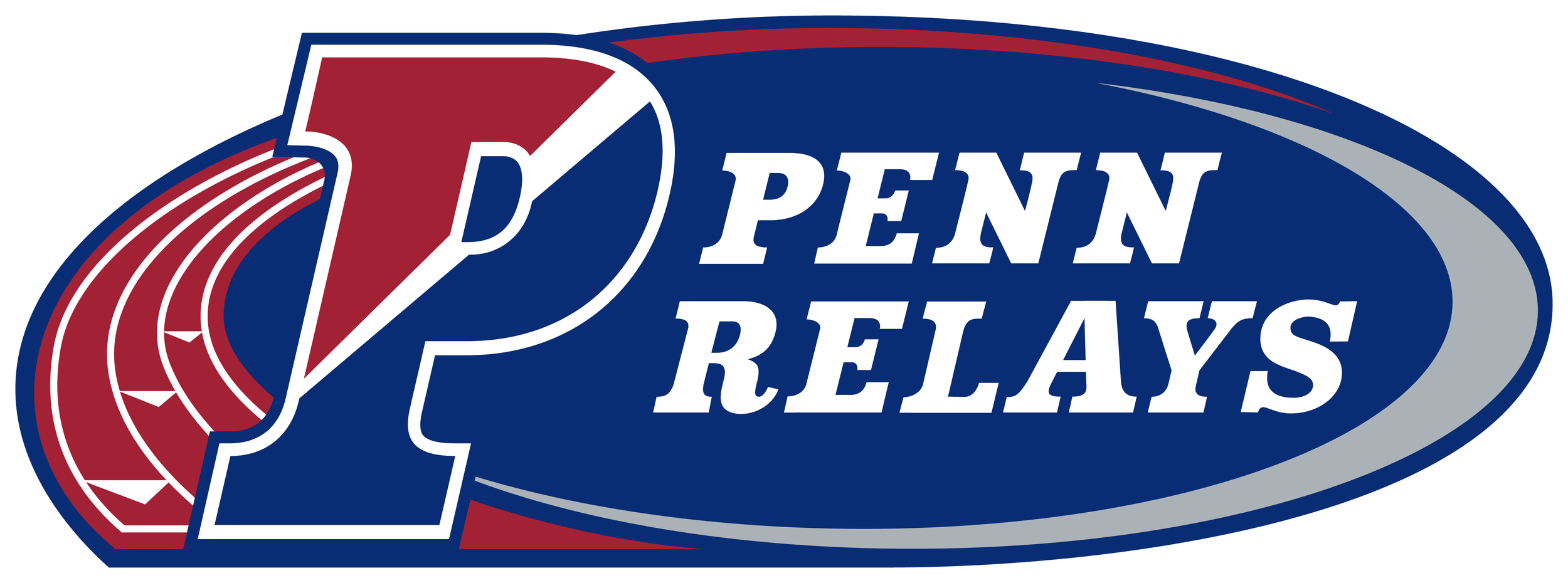
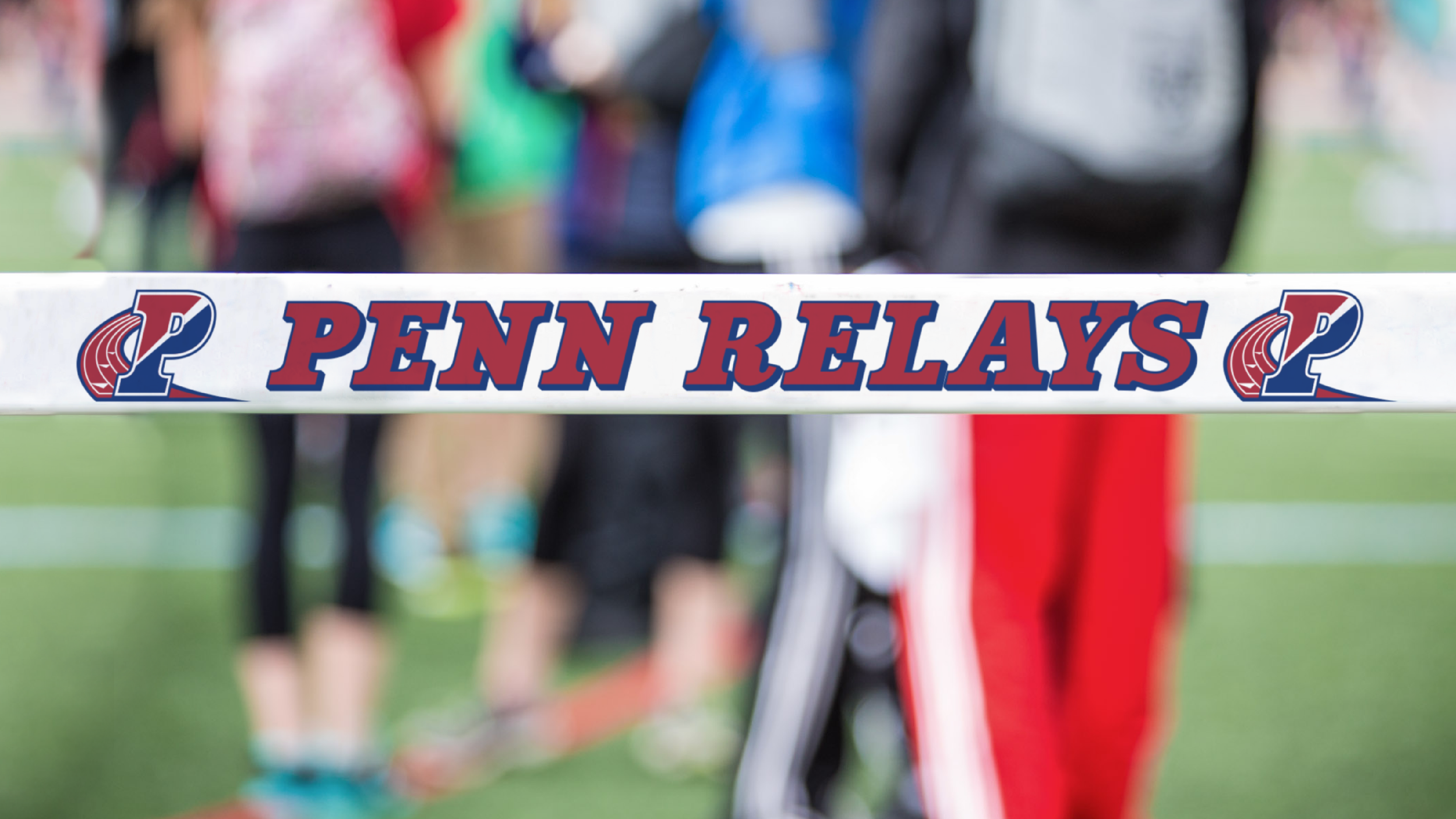
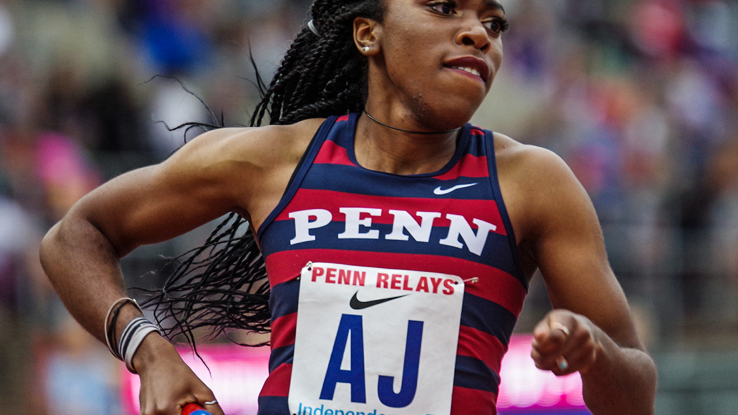
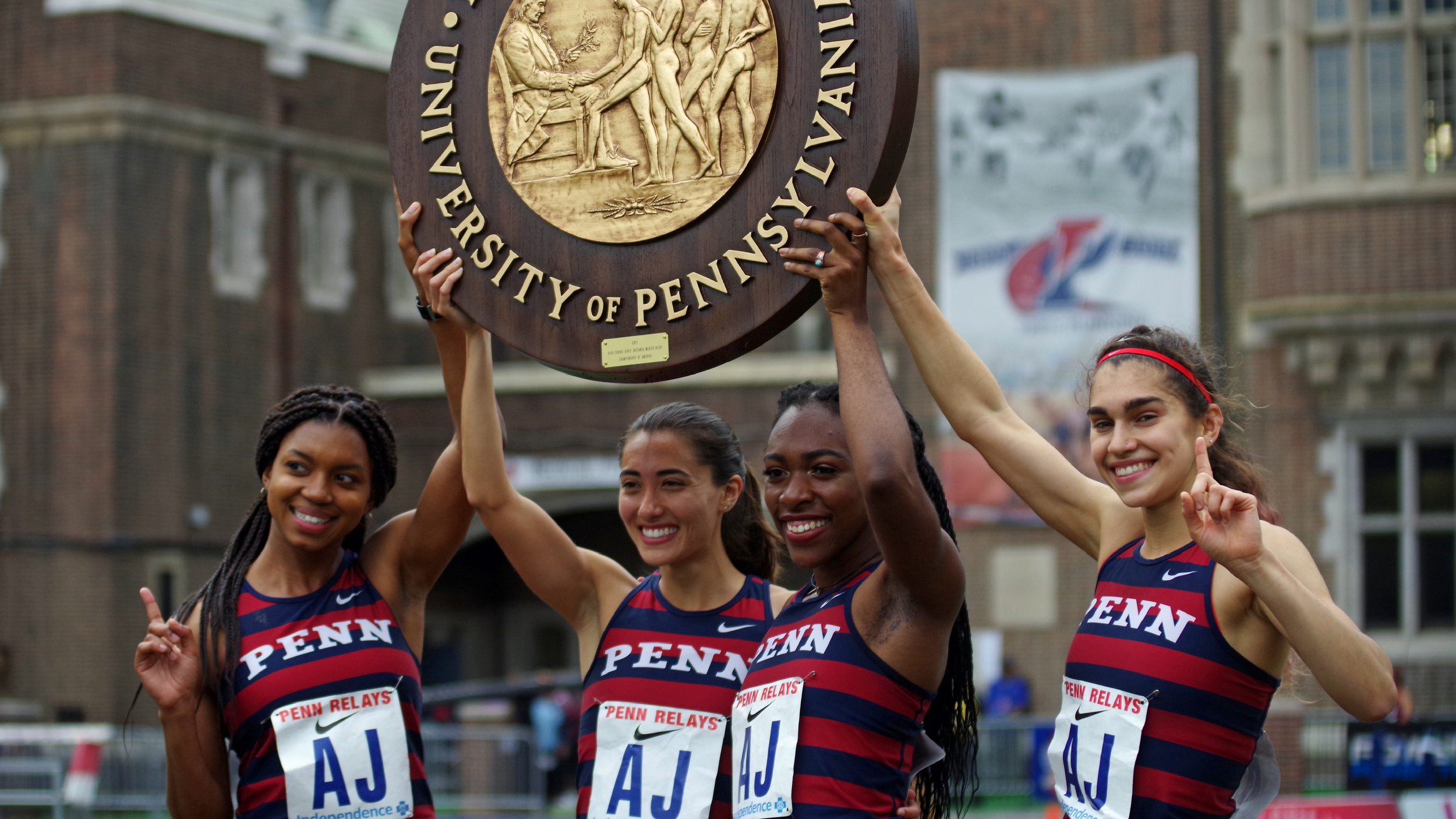
Beyond the competitive team sports, the University takes pride in the Penn Relays Track and Field competition which dates back to 1895.
An italic was created for the identity of this annual track and field tradition.











GOT A PROJECT OR OPPORTUNITY BREWING?