

Converse Visual Center & Brand Experience
Where
Handselecta
Role
Font Designer
Thanks To
Nike Basketball
R/GA
Lead Agency
Who
Nike
When
2008
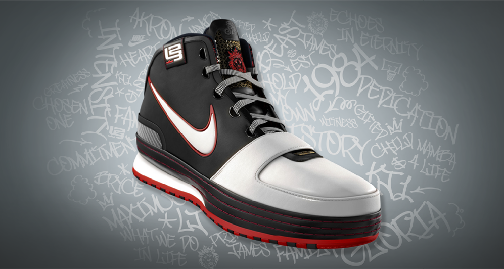
In 2008, R/GA invited me to help create the digital launch experience for the Nike Zoom LeBron VI.
One of the first models in LeBron’s line designed to move comfortably between the court and everyday wear, the VI marked a broader shift toward lifestyle, identity, and personal storytelling.
A central element of that identity was LeBron’s own handwriting, which lined the shoe with his biggest inspirations.
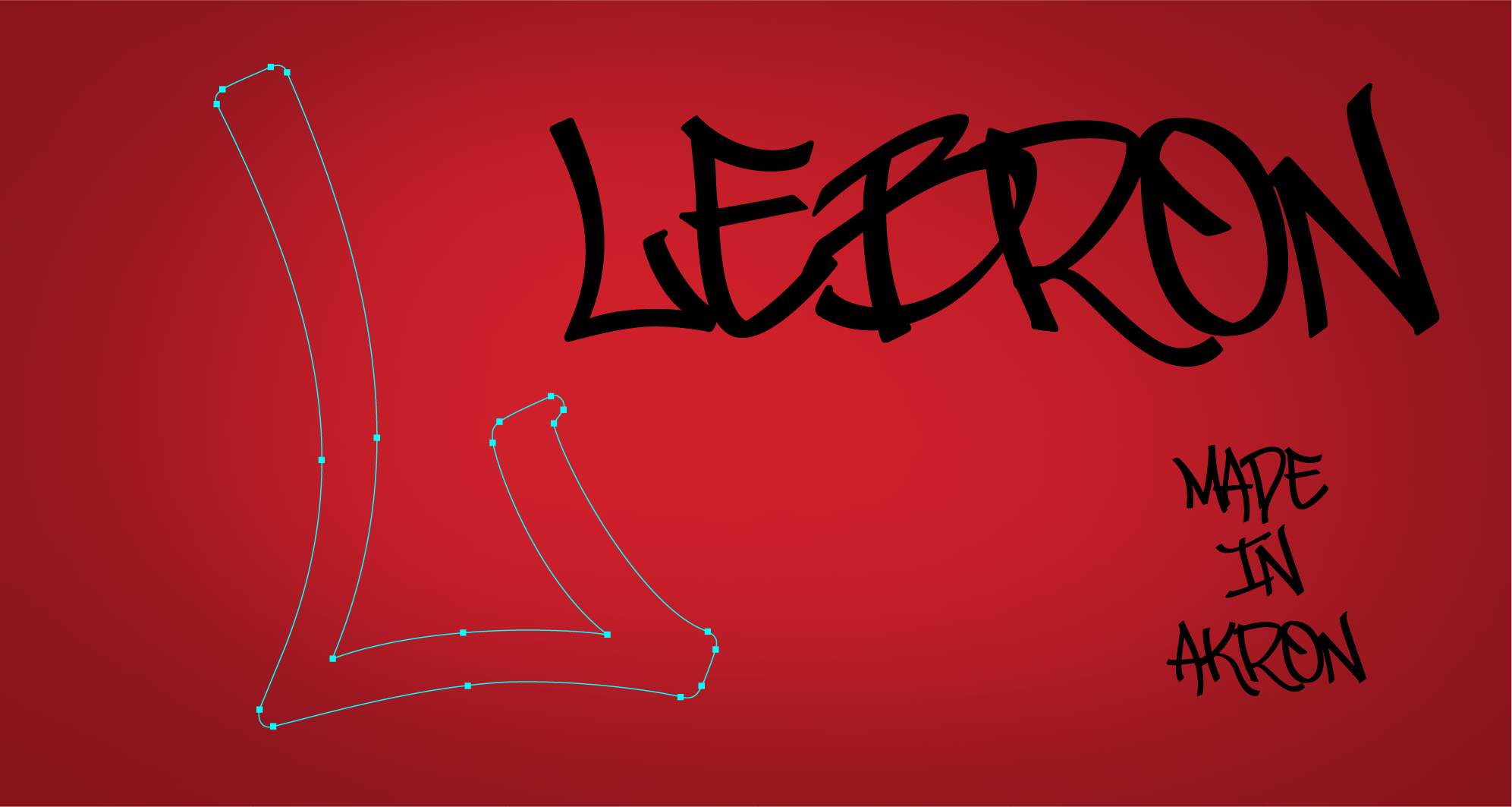
My role was to transform that pattern from spontaneous marks into a complete, functional typeface that could be used consistently throughout the launch.
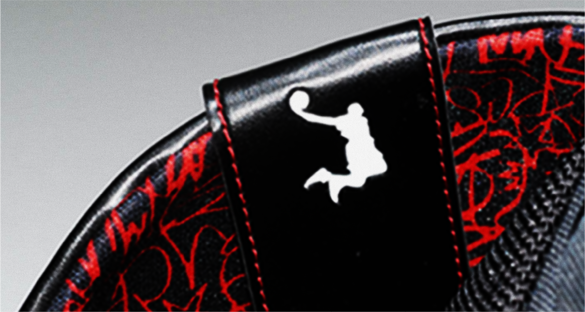
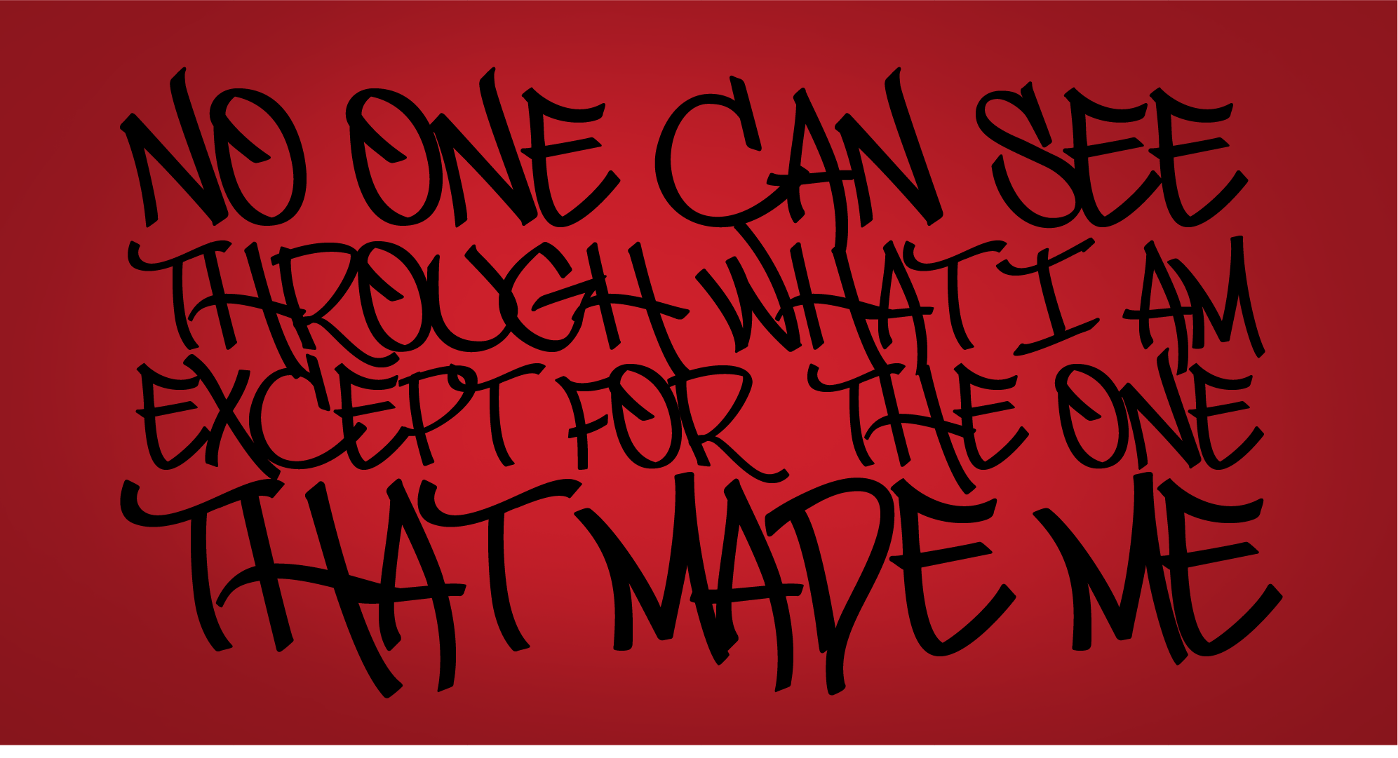
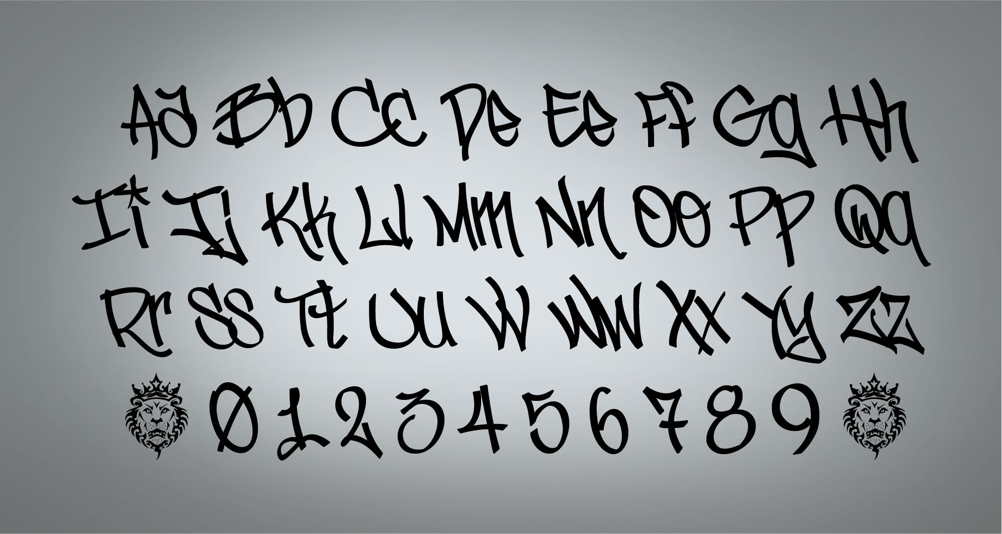
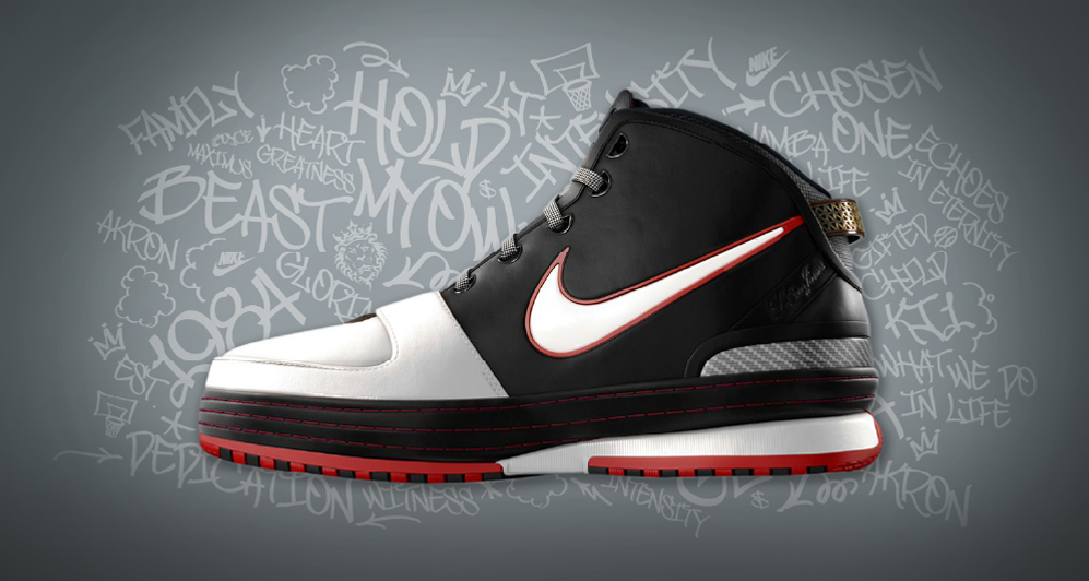
LeBron’s writing was never intended to function as a font.
It was irregular, expressive, and deeply personal. Building a working alphabet required studying its rhythm, reconstructing missing characters, numerals, and punctuation, and creating enough consistency for digital use without sanding away its character.
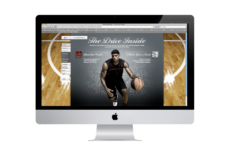
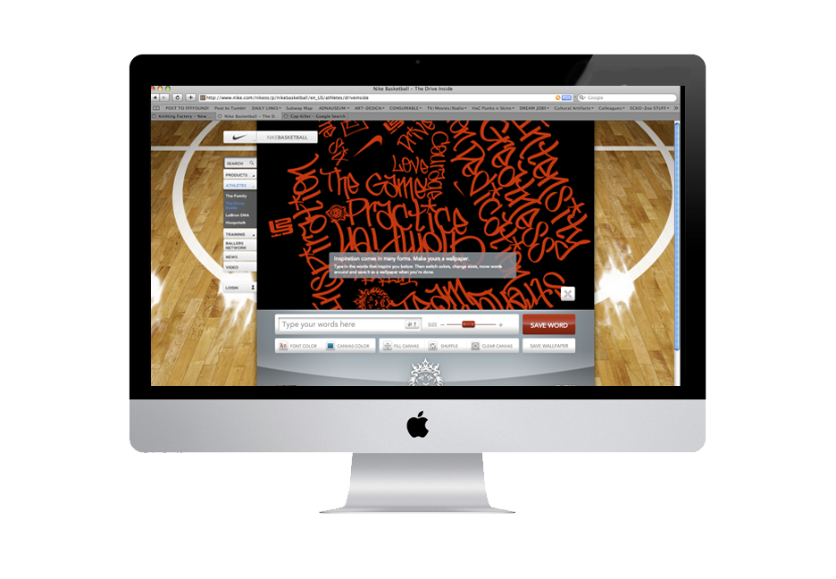
The resulting type system gave the campaign a direct connection to LeBron’s voice, extending his personal language across the microsite, launch graphics, and the visual world surrounding the shoe.











GOT A PROJECT OR OPPORTUNITY BREWING?